PTV APP REFRESH
UX/UI REDESIGN
2020
Melbourne ranked as the world's most liveable city for seven years in a row, from 2011 until 2017. Despite this, the primary PTV app, which assists with navigating all public transportation across the VIC state, has an average rating of 3.5/5 stars for Android and 2.1/5 stars for iOS. Upon review, it's clear that users are facing many unnecessary difficulties while using it. Based on figures published in the annual report for 2017-2018, the PTV apps were used on average 714,000 times per month.
This indicates that there is a large number of users who are having a hard time using the app and are not satisfied with the experience. To address this, PTV should focus on making a more user-friendly app and improving the user experience. To keep up with its ever-growing presence, I propose refreshing the usability of this app with the following key features:
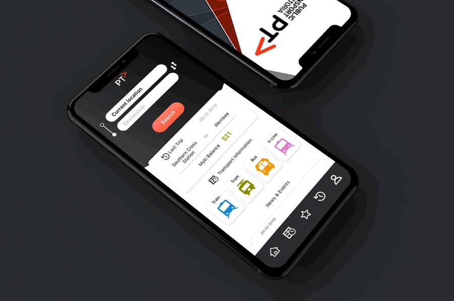
Dashboard
- • Search box in dashboard
- • Route history and last searching checking
- • Myki Balance
.png)
Search Result
- • Route option usability improvement in search result
-
-
.png)
Route Detail
- • Route detail usability improvement
-
-
.png)
EVALUATION OF USER EXPERIENCES
User reviews catergorised into the following 4 categories gave direction of how to improve user experience for the app: incorrect information, Link with myki, App navigation and Route suggestions.

783 REVIEWS
40% of complaints were regarding incorrect time/information.
30% of complaints were regarding the app not being able to link with myki.
20% of complaints were regarding Information architecture improvement that could break down into:
- Difficulties with finding the fastest route.
- Difficulty navigating the homepage - not user friendly for first time user.
10% remaining complaints were primarily regarding App bugs.
Incorrect information


Most of the users felt incorrect times were displayed, especially “arrive time”. An accurate “arrive time” would eliminate confusion.
Link to Myki


In most reviews, users compare with other transportation apps, such as Sydney Opus. There is an expection of PTV having one of their favorite feature- “top up myki on mobile app” which is nonexistent.
Information architecture


There are many varied complaints regarding missing features and information.
The most common of these are the following: a lack of suggested routes, information is difficult to intuitively discover and previous routes not being saved or easily accessible.
VALIDATE THE DATA
Before starting the redesign of the app, I needed to validate user reviews and ensure time isn’t wasted focusing on unnecessary changes created by misinterpretation of the data.I investigated the current PTV app imitating the perspective of the user, using the reviews to discover and define key pain points which cause user difficulties within the app.
Incorrect Information
In the current app, after clicking into the search result, I find the “depart time” in grey color includes a walking period, but you can’t find the walking icon. When you click into it, it shows a different “departure time” in blue and doesn’t cover the walking period.It leads to some users to be confused

Link with Myki
Despite having the capability to “manage my myki” on the PTV website, this feature is not supported in the current PTV app, forcing users to download unofficial or third party app which support the features of managing or topping up their myki.
APP Nevigation
The home page for the PTV app places users at a confusing and almost irrelevant start point leading to uncertainty as to where to start to plan their journey.The primary function used by most users is the ‘Journey Planner’, by not using this as the home page, Users task time is longer and perceived task difficulty increases.

Current PTV Home page

Current Menu Navigation
DESIGN EXPLORATION
From my personal experience and from research I have ascertained there are 2 main reasons for people to download PTV app instead of using Google map.
(1) Link with Myki : After they downloaded PTV app, users realize there is no consistency between the app and PTV website, which provides users the ability manage their Myki.
(2) Platform : Google map doesn’t provide which station platform to take the train from, forces users to need another app to assist or need metro station staff when they start their journey.
I wanted to explore the design readujstments of the following directions in the PTV app : Myki balance checking, refresh the information architechture, consistent route visual language
Lo-fi Wireframe
To construct a new usable feature, one of the most important step is to start with wireframing and get to know the basic structure that I could use to start designing.In my initial structure is putting the metro map in the front page. However, I noticed a lot of people downloaded PTV app not for locations, but to instead get more transport information.PTV app is aiming to provide users with an effective way to access transportation information, to keep this goal, I come up with ideas how I’m gonna start my design.
-
Use Tab bar instead of hamburger menu
-
Showing price in each journey
-
Search result page
-
Myki balance is able to check in dashboard page
-
Search box

Core Experience: Route discovery
In the current app, two of the primary issues for the users is that users are given insufficient information after they select their destination, likewise once their destination is selected there is insufficient information displayed in route options.Throughout their discovery, users are not able to find the route which best suits their needs immediately. (fastest route, less transfers, less duration..etc.)
To improve the usability, users need to be able to immediately find information for the route they choose. My solution was built on the following principle: Route should be treated as part of UI. Using Cards to show users their options to reduce the cognitive load. Belows are various cards exploration, I aim to make user get the most informations from a small card and aid them to choose the best route to suit them.

Timeline design exploration
For accurate route detail, I wanted to be consistent with route cards while showcasing an aspect of the Transportation vibe through use of color.The main issue seems to be PTV throwing every text information at the wall to see what sticks, instead of really developing a consistent visual language that make users enjoy their journey.


INITIAL REFINEMENT
To narrow down the design options, my first filter was “Do users understand?” - whether they are able to understand the connection between the abbreviation, button, color and text I used. Before I user tested to find out the answer, I selected two versions which I think will provide helpful and engaging content while they’re traveling.assigned the name of “stop to stop” for Version 1, for Version 2 I named it as “door to door”

USABILITY TESTING
To validate the two new redesign versions, I found watching people/users test both was an effective way of understanding what worked and what didn’t in either interface assigned 4 users to conduct this test, they are all based in Melbourne and have previous experience in using the PTV app.
Variance
In this test, there are 2 sets of version variances, Version 1: stop to stop, and Version 2 : door to door. With the exception of the “route options list” and “route detail” pages, the rest of the navigation pages are the same.
.png)
Process
Users will be assigned a random version and given randomized tasks to complete.Start from the basic task on dashboard, I mainly want to know if the users can navigate and understand the content, or if people get confused or lost.Then I’ll give them the tasks in random order, there are 3 tasks in each versions, which are 6 tasks in total, plus one task sharing the same feature in both of versions, then I invite them to share their feedbacks.
.png)
Use Case

Based on task observing and feedback, I make a pros and cons analysis as below:
Version 1: stop to stop
(+) Easier for user to find the route which best suits their needs.
(−) Departure & arrive time are confused, platform font size is too small, Not sure of abbreviation.
Version 2: door to door
(+) Easier to see Departure & Arrive time, Price showing.
(−) Too much information, No route suggestion, Spend more time to decide the route.

Version 1: stop to stop

Version 2: door to door

Test Conclution
1. Change warning text color
2. Route detail page combine advantages in Version 1 & Version 2
Users get confused which train was cancelled when they see the red warning color after they have clicked into route detail. Changed the text into yellow, so it won’t distract users who want to focus on the main informations.
I combined the upper card information from Version 2 to Version 1, users find it easier to access more informations using this page.

3.Change Departure and Arrive text color
The route options in Version 2 shows too much informations, it decreased usability. Based on testing result, Version 1 is easier to find the best suit needs for the trip, but it might make users unsure of which one is departure & arrive time, it may help if I changed the text background color.

4.Train line abbreviation
If I only use one letter to represent train line, it would be hard to distinguish which line since there is multiple lines with the same letter, for example Williamstown and Werribee. Changed it to a 3 letters code, most of users could deduce which line it is.
FINAL VERSION
