A Dual Transformation: From Legacy to Cutting-Edge
Rebranding
Platform Migration
Journey Overview
As Senior UI Designer at Telstra, I spearheaded multiple projects during a period of dual transformation involving simultaneous rebranding and platform migration. My work encompassed streamlining white-label B2B partner sales processes, unifying user experiences across brands, upgrading our technical platform and design system, and redesigning crucial touchpoints like the order confirmation page. By focusing on solving immediate UI challenges while preparing for future omnichannel capabilities, I not only enhanced Telstra's current digital offerings but also positioned the company for continued innovation, showcasing the pivotal role of UI design in driving large-scale organisational change.
The Challenge
Imagine a customer, Sarah, trying to purchase a mobile plan through one of our partner brands. She's excited about the offer but becomes frustrated as she navigates through an inconsistent checkout design, ultimately relying on an agent instead of completing self-checkout. This scenario isn't just hypothetical – it's a recurring issue highlighted in our user feedback.
We're losing market share in regional and remote areas, particularly among younger generations. Competitors are winning with differentiated products and digital solutions. Meanwhile, we're updating our front-end platform from LWC to React and modernizing our design system, but our checkout process still relies on the old system. As a result, customers encounter inconsistent styles and experiences while navigating the flow.
UI Strategy Approach
.png)
Align & Unify
Gather the existing components and harmonized component styles between AEM and LWC platforms

Transition & Upgrade
Migrated from the old design system (TDS) to the new one (Able 1) for eCommerce.
.png)
Future-Proof
Laid groundwork for upcoming omnichannel integration using React and our next-gen design system (Able 2)
Navigating Business Rules & Stakeholder Collaboration
Given Telstra's extensive presence in telco, our next step is to understand the business rules in various scenarios. This involves collaborating with key stakeholders to align with legal standards and operational requirements. Once we understand these rules, we can tailor our strategies and operations accordingly.

We ran a workshop to understand business rules in different scenarios
Laying the Foundations: From Scope Definition to Brand Principles
Define scope & Impact
At this stage, we've gathered critical insights from various business units to define our scope, evaluate the impact, and initiate the design process. My goal is to streamline the checkout experience across all partner brands and increasing conversion rates. By bridging the gap between old and new systems, we aim to create a seamless, cohesive user interface that not only meets current needs but also sets the foundation for future improvements.

Kick-off session - Define scopes and impacts
Create Brand Guiding Principles
With internal UI teams
In parallel, we had numerous UI designers and devs from various teams participate in weekly sessions for the White- label project. Together, we defined the whitelabeling principles and the way we work with our partner brands.
Why Brand Guidelines are crucial for White-Label projects?
Defining guidelines together helps us create a compass for white-label projects and rebranding efforts. These guidelines provide a flexible framework that allows customisation while preserving our core identity and quality standards. By clearly defining the use of logos, colours, and layouts, we streamline the adaptation process for our partners.
These guidelines serve two key purposes:
-
Future-Proofing: Prepare us for smooth transitions during future rebrands
-
Partner Management: Set clear boundaries for partner customisation requests
This strategic approach helps us maintain a seamless user experience across all brand implementations while allowing for individuality. The result? Time savings, product integrity, and a consistent user experience, no matter which partner brand is front-facing.

We defined what will be allowed, grey areas, and what will not be compromised by the brand.
A Three-Act Digital Transformation
Imagine our checkout process as a well-loved but outdated stage play. Our mission? To renovate the entire theater while the show must go on. This is the story of how we orchestrated a seamless transition from our old platform and design system to a modern, flexible solution—all without missing a beat in our performance.
Act I: The Set Redesign
We began by replacing the old components from our TDC design system, carefully updating the layout in our LWC platform. This wasn't just a fresh coat of paint, we meticulously aligned each element with our new exploration page, ensuring functionality and aesthetics worked in harmony. It was like updating the stage props and backdrops while the actors continued to perform.
Act II: The Platform Shift
With our new set in place, we turned our attention to building these components in Able 1, our new design system, using React as our new platform. This phase was akin to upgrading our entire backstage technology—new lighting, sound systems, and stage mechanics—all while the play continued without interruption.
Act III: Looking Ahead - The Omnichannel Vision
As we complete design system and platform transformations, we're already planning for the future. Our vision includes fully transitioning the checkout flow to React, laying the groundwork for a truly omnichannel experience. We're constantly auditing and refining our current work, keeping an eye on future capabilities. It's like designing our theater to eventually accommodate not just plays, but musicals, operas, and interactive performances—all on the same stage.
This digital transformation isn't just about technology, it's about crafting a seamless, engaging experience for our audience—our customers—regardless of how they choose to interact with us. And like any great performance, the real magic happens when the audience doesn't see the complex choreography happening behind the scenes.

01
Order confirmation page redesign
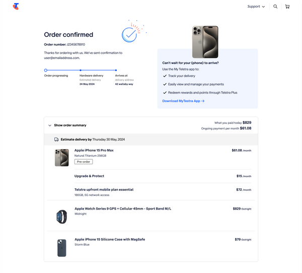
We now have design principles and business rules from the previous stakeholders' workshop. This project serves as a great example of how we consider long-term goals during our current work. We integrate user needs, the business North Star goal, and our design rules to create both a 'Design North Star' version and a 'Day 1 Achievable' version to present to the company. Our aim is to celebrate users at the end of their order journey rather than leaving them with a standard confirmation page.
Before
Design system: TDS
Platform: LWC

02
White-label
Project
After
Design system: ABLE 1
Platform: React

This B2B project aims to create templates that our partner brands can customise while keeping a consistent and user-friendly experience. By finding key areas for customisation, we allow partner brands to add their unique touches without affecting usability or design quality. This way, we build a flexible and scalable pattern that meets various branding needs and ensures a smooth and consistent experience across all brand interfaces.


My key learning
Balance Flexibility and Consistency
Designing for white label requires careful consideration of customisation points.
Strategic Phasing
Breaking down complex projects into manageable phases is crucial for success.
Cross-Functional Synergy
Clear communication across teams to better integration and outcomes.
Future-Oriented Design
Considering long-term goals during current work saves resources and ensures scalability.

NEXT PROJECT
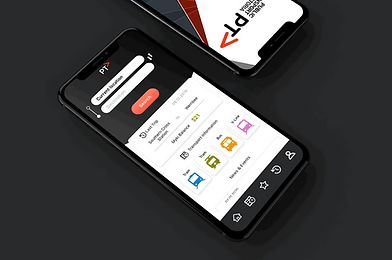
This redesign project increased customer engagement by providing more value-added features. PTV app which assists with navigating all public transportation across the state has an average rating of 3.5/5 stars for android and 2.1/5 stars for IOS. This indicates that a large number of users are having a hard time using the app and are not satisfied with the experience. To address this, the PTV should focus on making a more user-friendly app and improving the user experience.

