
Enhanced the checkout experience
My role
UX/UI Designer, I led the checkout design, research and collaborated with 1 design lead, 2 BAs and 4 product managers.
Duration
1 year 2020 - 2021 (From design start to dev start)
About
As an iconic retailer brand in Australia, we wanted to know which process in checkout had room for improvement after an annual performance review. I was a part of an ambitious project to redesign the checkout experience for the evolving business to meet the Y21 mission which was to improve the customer shopping experience across our omnichannel.
.png)
While I signed the NDA, I have avoided the non-disclosure information, I can only provide the information from my own perspective. All information here is my own and doesn't necessarily reflect the view of the company.
The Goals
Checkout was a big chunk of work and it required different teams' collaboration to achieve the goal of reducing the cart dropping rate, as well as improving the checkout pain points.
Our high-level goals were to:
1. Make checkout fast and easy to use for everyone, increase public awareness of our organization and its mission
2. Improve user experience across omnichannel (Online and in-store)
3. Create a deeper engagement for existing and new customers.
Project Timeline

The challenges & approach
Challenges
We got some early insights from the annual performance report. The report showed us that the main competitors have a one-page checkout feature, which helps them get more people to finish shopping. However, we need to find out how to make our checkout easier so more people complete it.
First approach
As this is a new challenge for everyone in the team. My goal in this conceptualization phase was to conduct competitor research to get first-hand user feedback and gather business perspective by doing stakeholder interviews and translating the existing research takeaways into actions and then team up with the design lead and product manager to workshop what hadn't yet been done, focusing on and exploring the next step and approach.
.png)
Competitors' key checkout features
The insights from the original experience
During the research phase, I formed the four main obstacles and brainstormed ideas to improve the checkout process. We also discussed the timeline for the project and the resources needed to complete it. Everyone in the meeting was very engaged and provided valuable input.
.png)
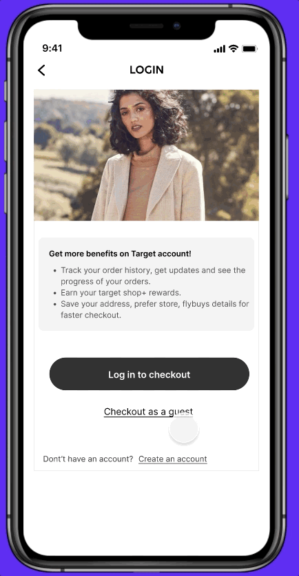
1. Guest checkout is not easy
We had 73% dropoff rate at this log-in stage. I noticed the "checkout as a guest" button will only appear after users type in their email addresses first.

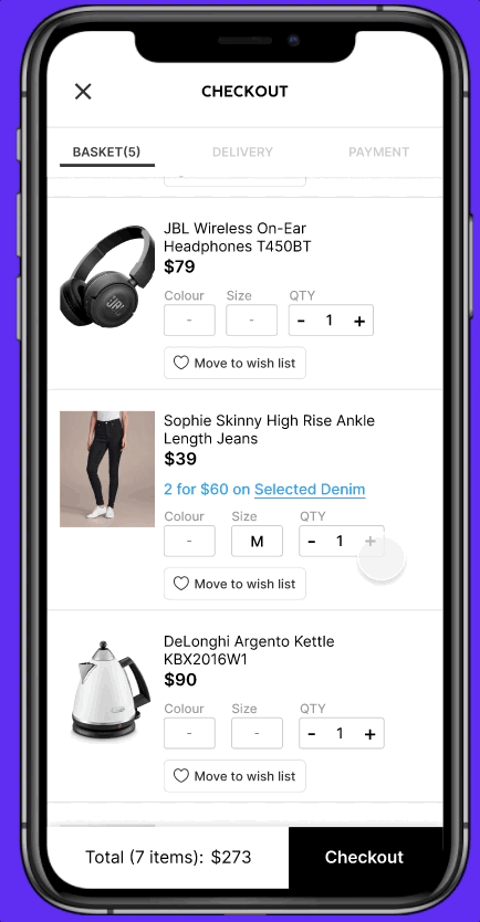
2. More control over the basket
Users find it frustrating when they can only change the quantity during the checkout process, they need to put more effort if they have to change the size or colour.
.png)
3. Pick-up timeframe
Click and collect item timeframe estimates can't convey which items you can collect when split.
.png)
4. Checkout process steps
If we want to help customers understand the checkout procedures better, how do we convey the design?
The quantity badge is confusing, I expect to have more control on changing the details, I need to put more effort if I want to change my email address, item size or colour.
34, Female, Australian
Identifying opportunities
After a workshop brainstorming session, I identified several tasks and pain points that could be addressed in order to achieve our goals and provide value to our customers. It was not easy to prioritize the pain points, but listing them all allowed us to form a hypothesis and assess potential opportunities.

A FEW IDEAS AFTER THE WORKSHOPS
We believe that giving users more control over the checkout page would help customers to self-resolve a high volume of back-and-forth time-wasting issues. We felt that this would have a positive impact on our cart drop rate and overall shopping experience.

Fast and easy checkout
-
Exposed guest checkout button
-
Allowed change items' colour, size and quantity at the checkout process
.png)
A better Exp. across Omni-channel
-
Suggest customers choose other shipping methods when part of the items are unavailable.
-
Clear timeframe and stock availability for each item with corresponding pick-up stores
.png)
Deeper engagement
-
Introducing an incentive bar to indicate how far away free shipping is.
-
Gamify the promotion experience.
User Flow

Design iteration & validation
In the closing stage of the project, I created two prototypes to ensure that users had a clear grasp of the functionality and information architecture. As no leading scenario was identified, we chose to employ unmoderated testing for this minimum viable product (MVP). My primary objectives in the designs are to validate two main elements.
-
Which is the preferable method for users to delete an item they don't want?
-
How does a user usually change QTY?

Version 1 - Multiple Items selection & Type in QTY
This multiple items selection control feature was inspired by the multiple email selection. The idea was that when a user is shopping online, they can select the items they want to proceed with during the checkout.
Version 2 - Cross to delete & Scroll to choose QTY
In version 2, users can click the cross icon to delete the items they don't want to proceed to checkout, and if they want to change the quantity, they can use the APP native built in scroll functionality.
We recruited 8 users for mobiles and 6 users for WEB, the tasks were:
-
Pretending you are shopping online, you are now on the basket page, if you want to remove the first item in the basket, what would you do?
-
If you realised you had chosen the wrong size of T-shirt, and you'd like to change it to M, what would you do?
-
If you want to proceed without the headphone in your basket, what would you do?
-
If you wanted to redeem your Fllybuys points, what would you do?
.png)
Key takeaways from UT 💡
-
Delete item - A removed icon button can probably do the job, but some users worried they'd accidentally tap it on the Mobile screen. Also, some of the users tried to swipe left to delete an item, which inspired me the new approach in the iteration.
-
Choose QTY - It takes more time and effort to type in the QTY than scroll, but scroll to choose is not ideal when users need to order a larger amount of items.
To our surprise, during the test, many participants mentioned that they were able to easily control the size and colour without having to go to the product page. Knowing that they had no trouble completing the tasks, revealing that our design offered users a convenient and faster checkout experience.
Key Features
01
Enjoy shopping, we will do the rest
You'll see how far away you are from free shipping or getting a reward when you add an item to your basket, incentive bar help you to visualise your shopping statement, and shop more to save more.
02
Your basket, your control
The item details have been designed to allow users to edit the quantity, size and colour at the basket level. Users not only can edit the QTY by taping the icon button but also swipe left to delete it. The features give users more control to save time editing items through product pages back and forth.
03
Log in as you like, one trip as you wish
We added log-in benefits to encourage customers to log in, if not, they can easily click on the exposed guest checkout button if they prefer.
In the final design, we also visualised the available pick-up timeframe, users can easily tell which items are able to pick up today and which items are not.
04
One more step to create an account
If a customer chooses to checkout as a guest in the previous step, they can create an account after they place the order. This way, they are able to check their order history through their account next time.


My key learning
1. Though we already have a few existing performance reports and legacy research outcomes, we need to make sure that our fresh research is in line with the latest industry standards. This requires us to thoroughly audit our current processes and designs and make adjustments where necessary. Running multiple moderated interviews helped me train the muscle and made it easier to gain user empathy.
2. Define a set of experience & business principles with stakeholders upfront. It also helps to set project expectations. Early communication is key.
3. Some user pain points may involve a complex system of components that require significant changes or an overhaul of the entire system to resolve. In these cases, I need to partner with project managers and engineers to develop a strategy and roadmap to address the issue and then can reduce the pain to a minimum as a designer.
4. Using native iOS or Android components for the app assists users in learning how to use the features faster by depending on their prior experience with those systems. Also, by using native components, developers are able to build a consistent experience in an app, save us the time to deliver the product.

NEXT PROJECT
I worked in an Agile environment to ship our very first B2B, wholesale agent console where businesses can sell Post-Paid plans in the Agent console. We enhanced the overall experience for customers taking up these services and enabled the eventual migration of legacy-based services to the Console.
